
The inspiration for Sam Nicklin’s “Colour Series”—featuring color-coded still lifes made up of various objects—came very much by chance. He noticed an orange bottle cap and a Playboy playing card of the same shade on his desk, and everything just clicked. He tells Rhys Thomas about how the order and symmetry in each work calms his mind, and about the joy he finds in everyday colors.
Sam Nicklin has had a few lives: he’s been an athlete, he’s worked in a jewelry store, he’s been a landscaper, plasterer and a graphic designer. Chiefly, the 29-year-old was set for a life as a musician, but a bipolar diagnosis made this “less practical” for him, he says. Then he found himself in still life photography. Despite being a commercial photographer really, it’s this personal work, particularly his “Colour Series,” which have propelled his career.
In April 2024, off the back of a hectic February and March, Nicklin suddenly found his work had dried up. These periods are challenging for everyone, but for Nicklin there’s a known and specific mental struggle too. “I have to keep busy, if I don’t my bipolar gets pretty awful, so I just have to,” he says. “The contrast made me itchy so I found I was trying to think about something to do. I’d always wanted to do still life, it was a form I’d fallen for as an illustrator. I figured I’d apply it to photography.”
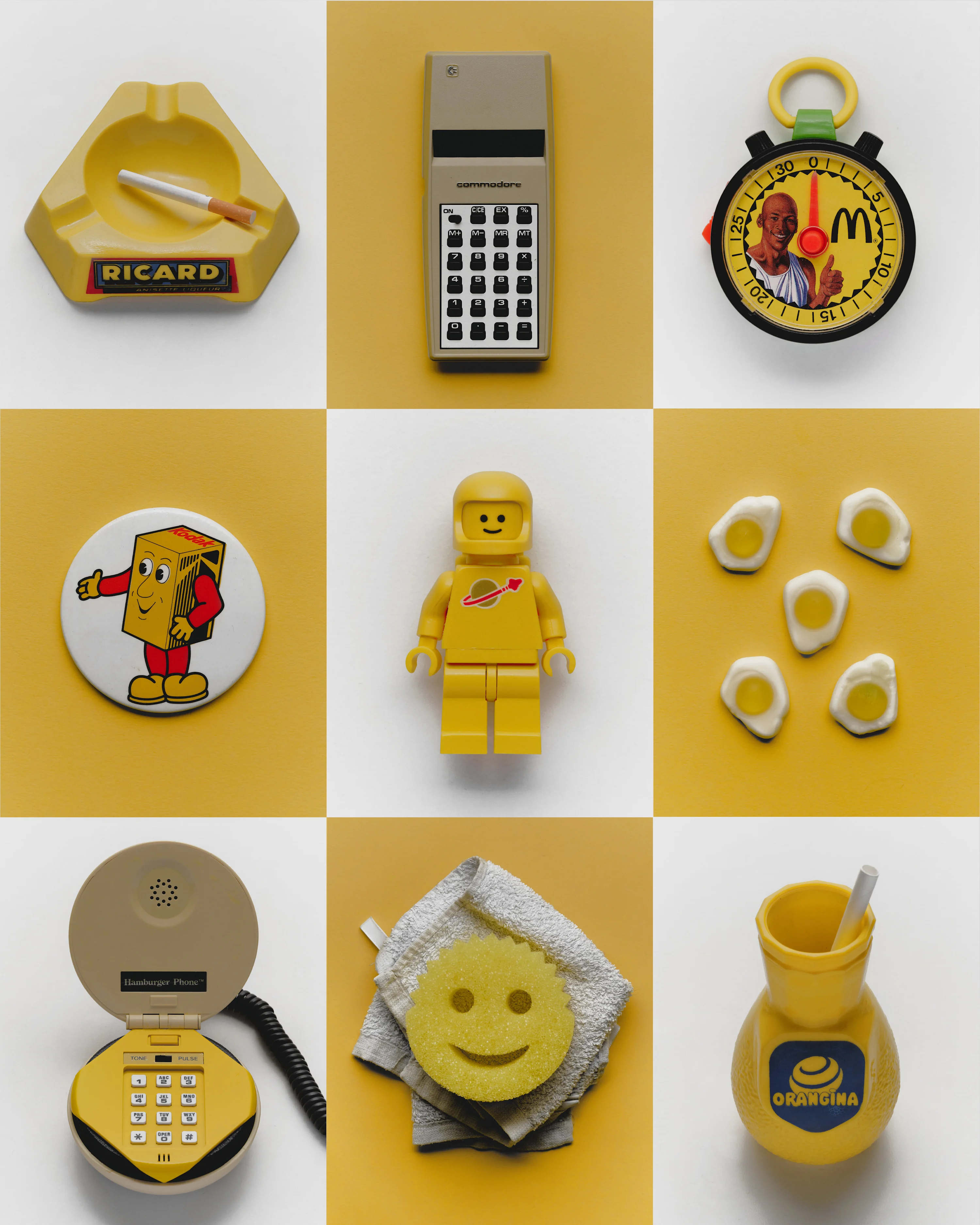
Sourcing the subjects wasn’t a problem. “I’ve always collected things, since I was very young. There’s hoarding tendencies in my family, so maybe it came from there but I just liked having something I could take around with me,” he says. This habit never stopped, and led to a small box of small things, and now a larger box of small things. Hundreds of things: ashtrays, lego men, rings, desk clocks.
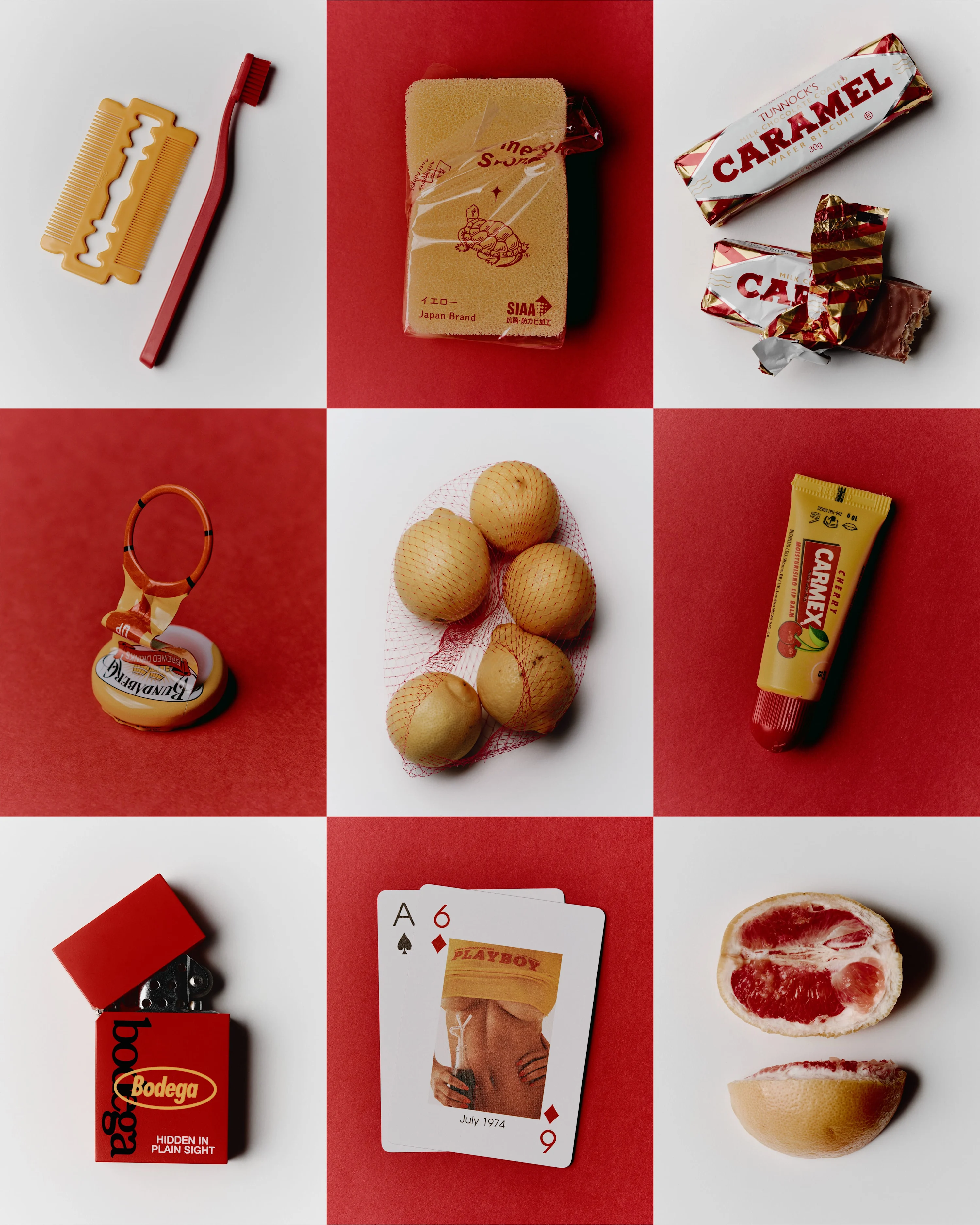
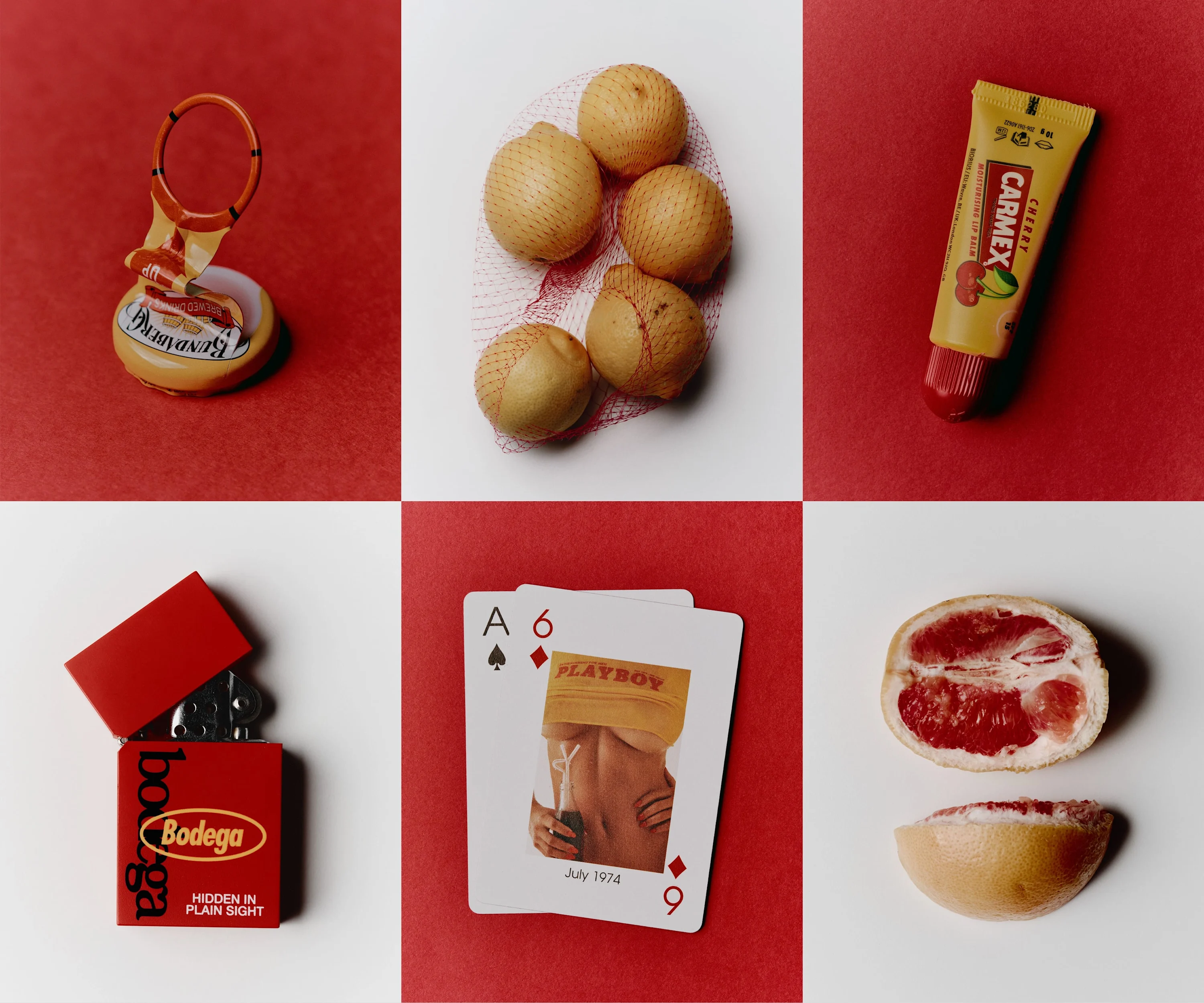
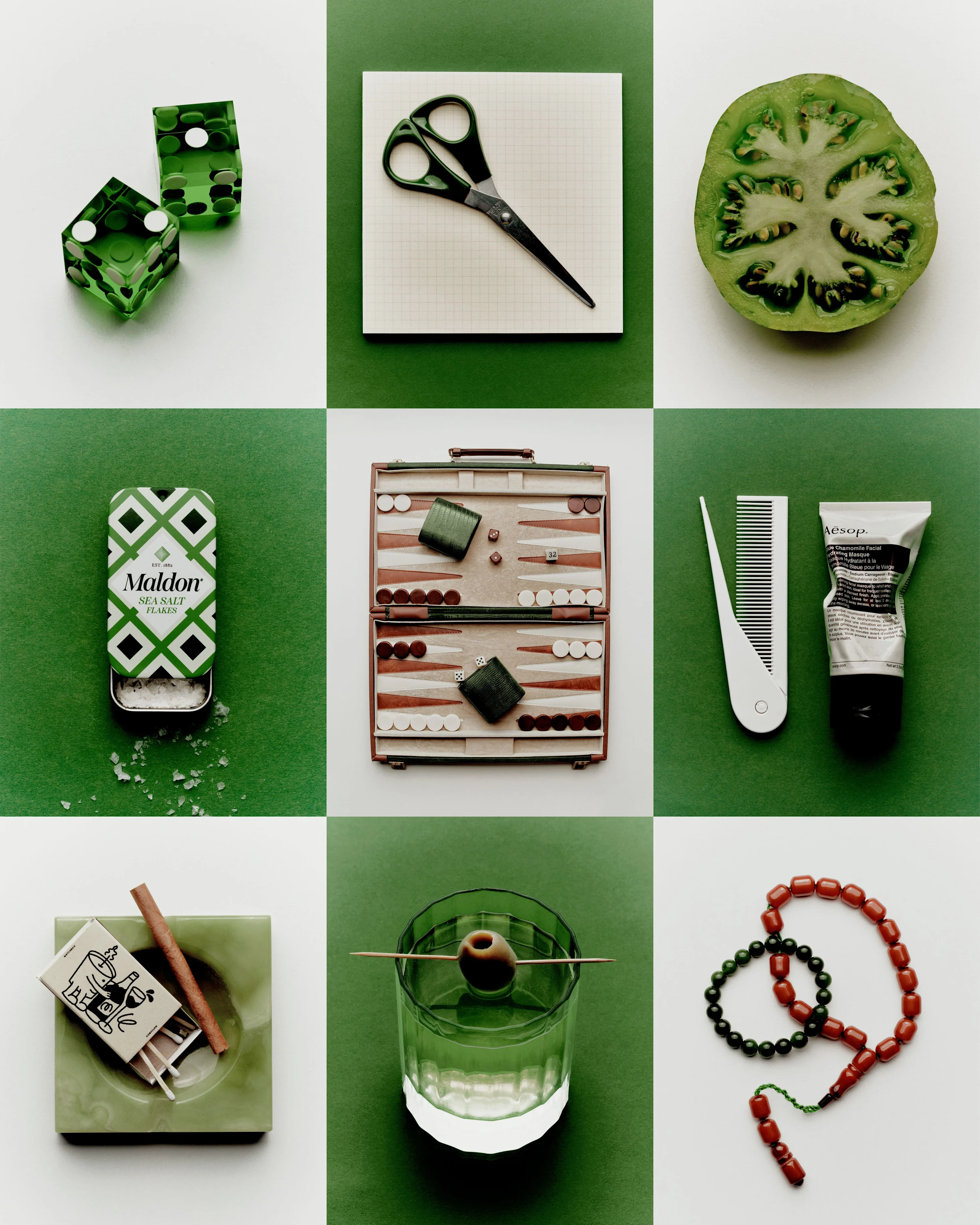
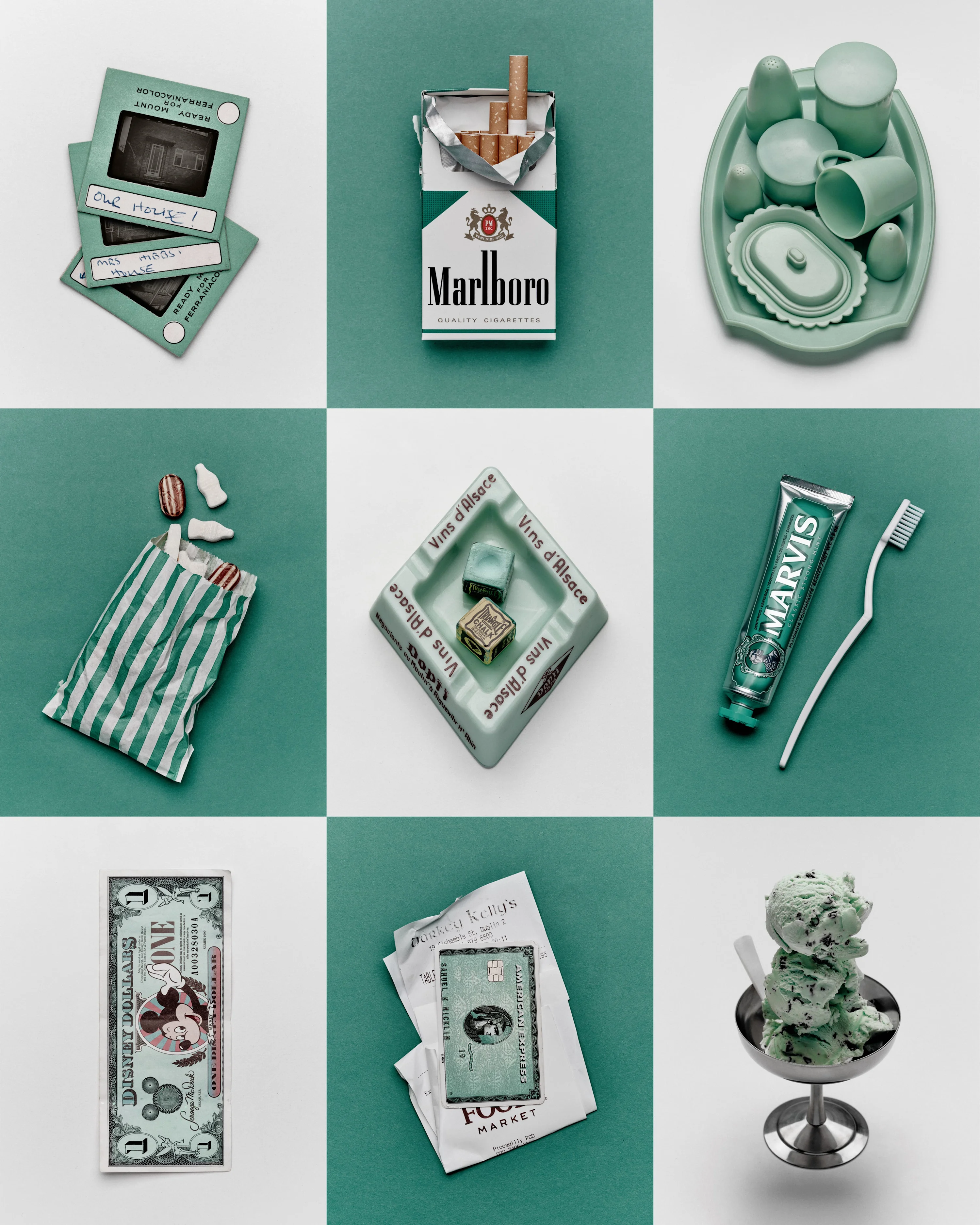
These objects became the focal point. First, he photographed fruit on the various silver trays he owned. A little while later, he was sat drinking a Bundaberg ginger beer and reflecting on the image, and he figured that it might be even better if the colors were all the same. “The cap from the ginger beer was on my desk, and my Playboy playing cards were nearby,” he says. “My favorite is the cover from July 1974. It’s often placed on top. The colors of the card and the bottle cap matched up and my brain just clicked.”
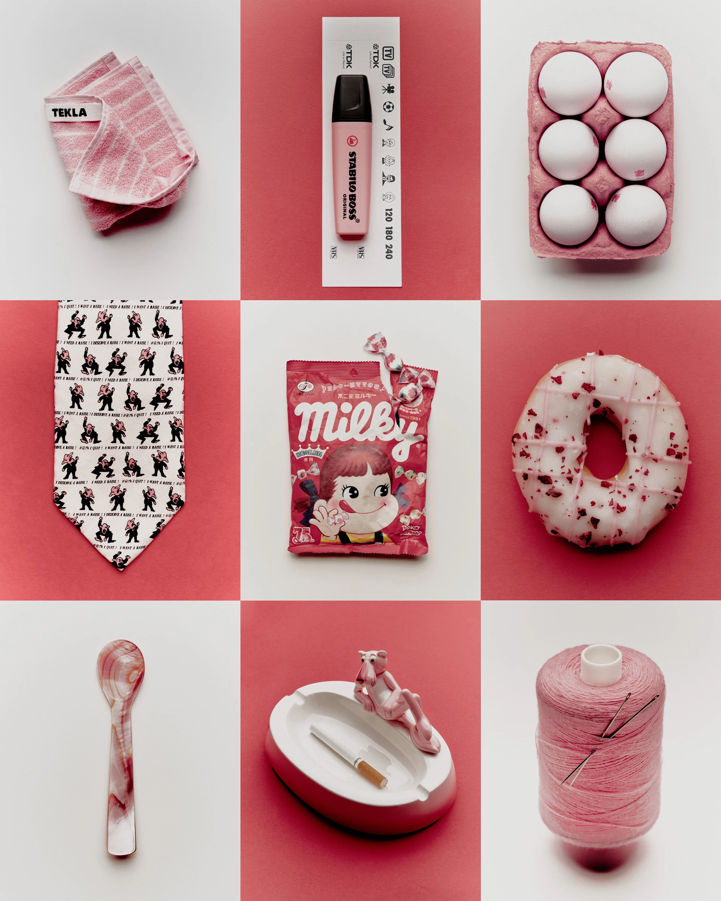
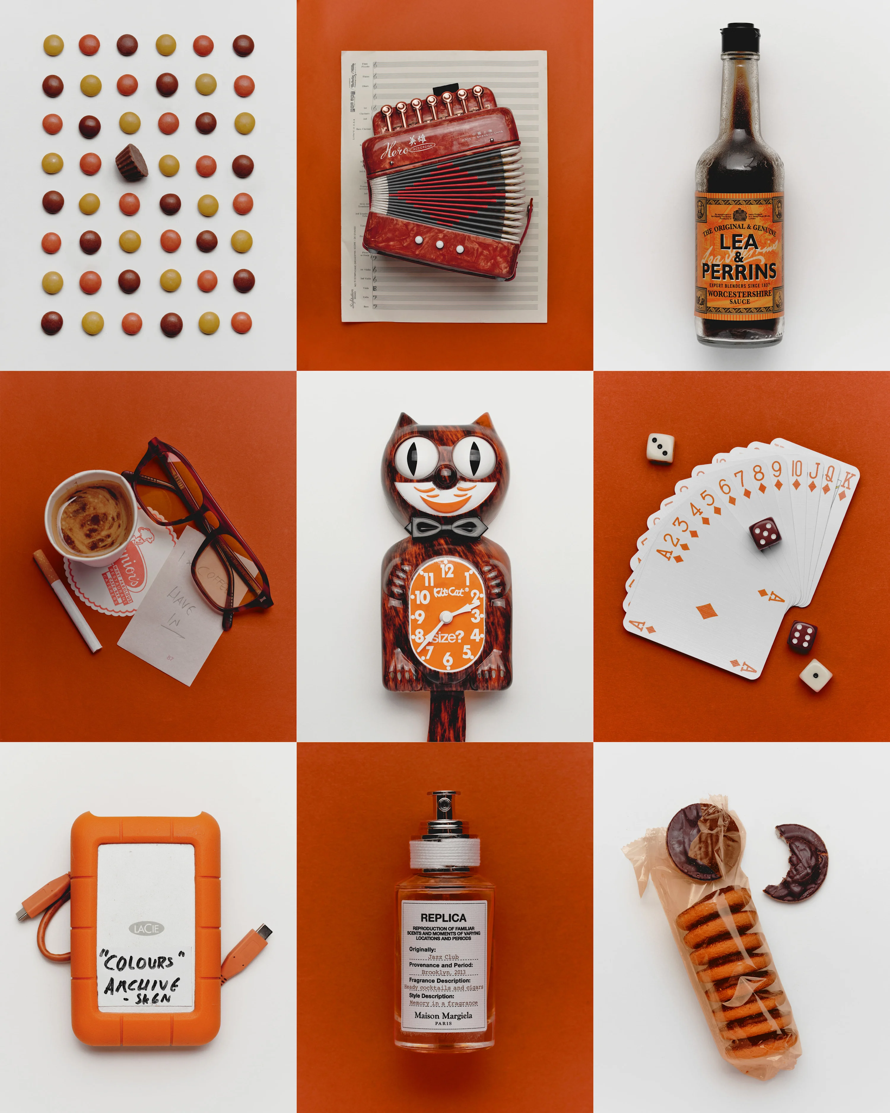
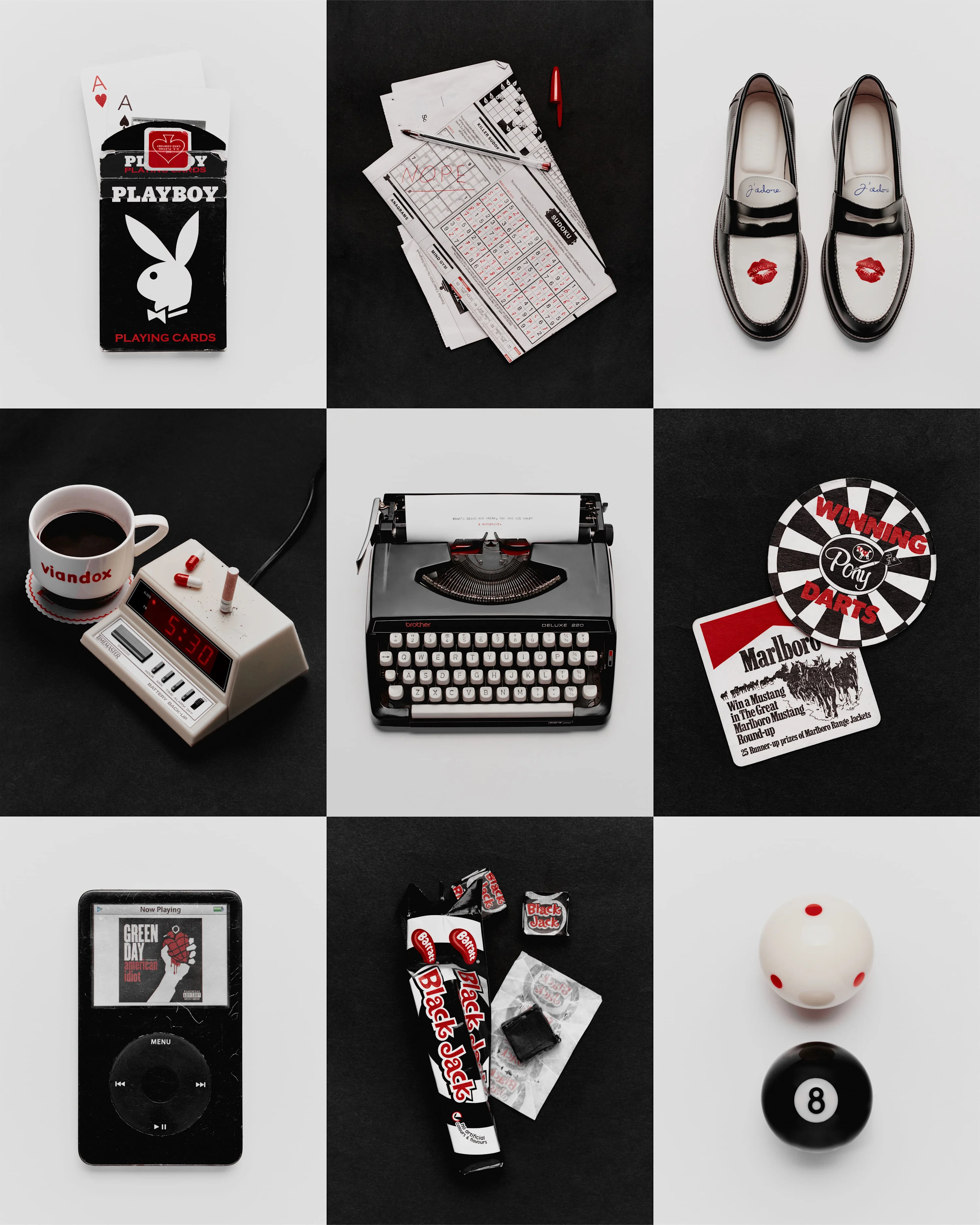
This led him to looking around his room and through the box for other objects that might work. “The intention was: same color subjects, alternate color panels,” he says, and soon enough, everything was in hand and the first of his “Colour Series” was born: red and yellow. The photos are shot on a Fuji GFX 100-2—medium format. “The detail is unbelievable, which is why I use it, but the color you can get out of it is great too. I use a one-light set-up, so it looks natural but well put together. For the backdrop, I use colored paper—you can’t beat print.”
“The symmetry and order were just necessary. It’s my bipolar I guess,” he says. “I was told composition first, then lighting, by a photographer I respect, and I’ve always followed that order since. Both are needed, of course, but composition is easier to neglect.”
For those viewing the work, the series does a few things. Like it does for Nicklin in the process, it calms our minds. It’s satisfying, neat and patterned. But beyond that, it makes us ask questions: why are these things together? And there’s an emotional charge formed when we focus on a specific object—memory, fondness. It feels personal. One person’s snooker chalk might be another person’s iPod Classic with Green Day’s “American Idiot” playing.
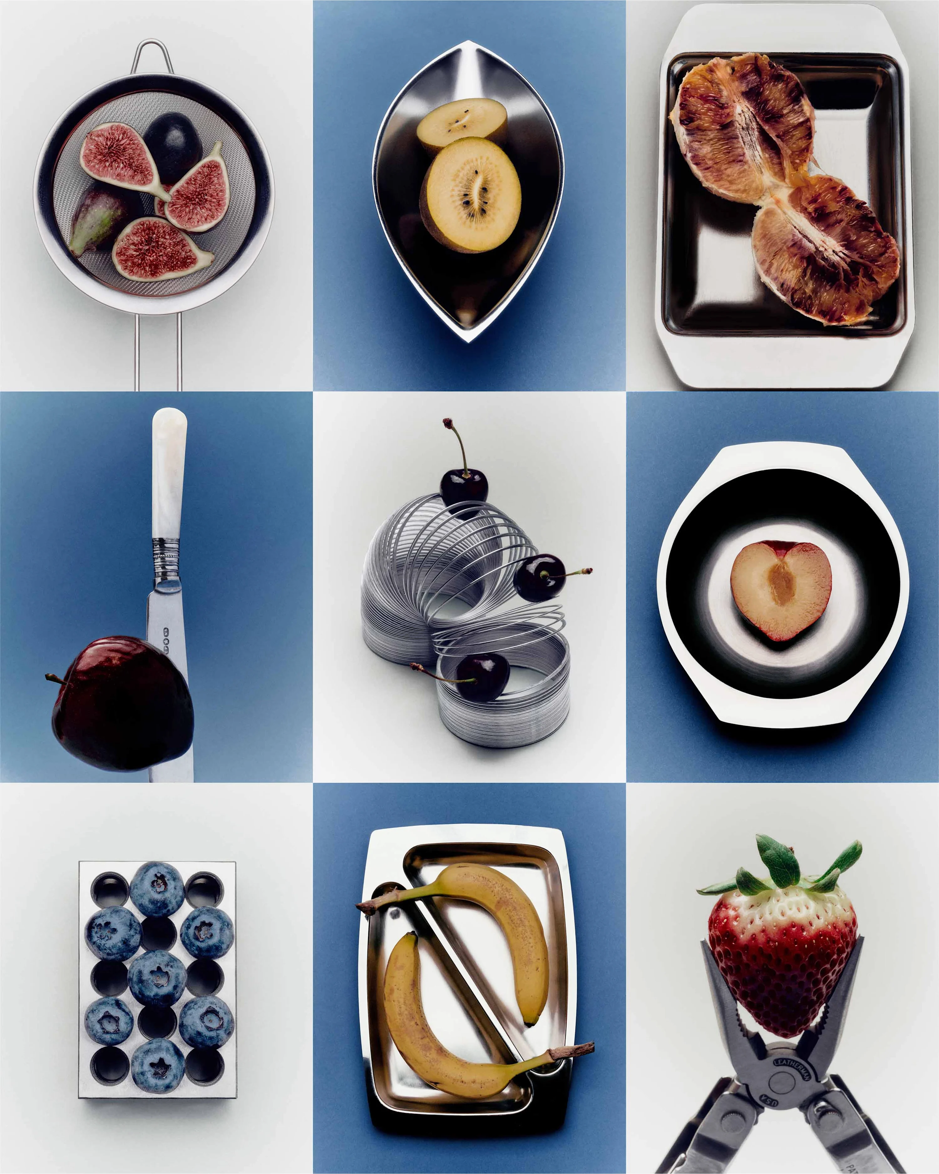
Even mundane things like blood oranges. Every time you open one of those up you think ‘what a color!’ don’t you… what a joy.
All of the grids started with one specific object, something that inspired Nicklin to get up and build around it. Examples include the golden kiwi on the fruit bowl, the Playboy cards, the shining green dice, the Pink Panther ashtray, the orange kit-cat x Size? clock. Where it works they’re placed in the center of the overall image. “If it doesn’t fit there I don’t mind,” he says.
Often, as well as the subject, the strange colors are a draw to him choosing his objects. “The subjects are very personal and important, and their colors are important and stand out more because they’re real colors, they’re what I’m celebrating,” he says. “I’m obsessed with the Pink Panther, and largely because of the shade of him.” He cites the classic “Dictionary of Color Combinations” by Sanzo Wada as a source for how he puts palettes together, as well as feel.
“This work is very personal, very me, and it is also the only thing that excites me as much as playing drums did,” Nicklin says, grateful that he has found a way to go through the world doing something he loves. “Actually, that’s something commercial partners keep saying to me since I posted more personal work—my enthusiasm is very appealing,” he says. He also mentions that every person he works with references the personal work before his commercial portfolio. “Passion projects are always the best projects” has become something of a hill he proudly stands on.
Listening to Nicklin talk about color is a beautiful experience—he marvels at the wonders of the natural world and how the human eye can perceive them. “It is wild to me that we can see the most beautiful shade of something out and about, and take a photo of that, and remember how that made us feel, maybe hope to recreate it on our front door one day,” he says. “Even mundane things like blood oranges. Come on, every time you open one of those up you think ‘what a color!’ don’t you? It’s a romantic thing to say, but also, what a joy.”