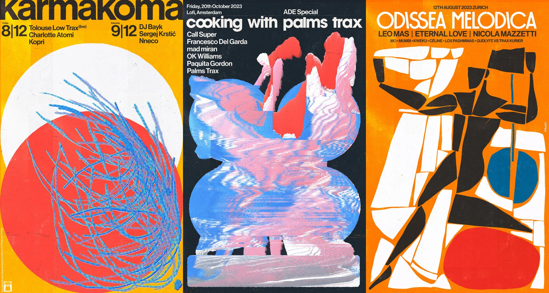

The nightlife event posters that could once solely be found pasted on surfaces around major cities now largely live in social posts and online ticket stores, but they haven’t lost their importance. Serbian designer Marko Vuleta-Djukanov’s posters are instantly recognizable as his. He tells Maisie Skidmore how sounds become shapes and colors in his mind, and how he treats each poster as an artwork in its own right.
There was a time, not so long ago, when posters were one of the only means available to club promoters for spreading the word about what was in the pipeline for the music scene. Designed to be printed at scale and pasted onto any available surface, they captured a mood, beckoned a crowd, and gave some indication as to what was in store and when and where you could find it. If you knew what you were looking for, you saw it all around you.

Not all of his works make it to the walls, but Belgrade-based Marko Vuleta-Djukanov designs posters with printing in mind nonetheless. He creates artworks, first and foremost: vibrant, dynamic, expressive and instantly recognizable as his. “I always prefer to make posters that also stand up as art pieces,” he explains over a video call from his desk. “I think that’s why, over the years, I’ve somehow managed to propose that the artists’ names become as small as possible, which wasn’t the case before! Nowadays, the main purpose of the poster is to stop people from scrolling past it.” Once somebody stops, he says, they’re going to look into the finer details of the event.
These are not easy images to scroll past. Vuleta-Djukanov followed a classic approach to art education, studying sculpture, painting and technology among other pursuits, and this experience forged his multidisciplinary practice. The work he makes now—for the past seven years he’s been designing posters, album artwork and the like—combines cut-out, hand-drawn and photographed elements.


His process kickstarts with a feeling. “If I’m working on a record sleeve, I want to hear the music. After that, I start working on the visual.” I push him to elaborate. How does a track inspire an image, or a color, a collection of shapes? “It’s how I imagine the music could transcend into an image,” he says. “I just try to present it in a visual way.”
There’s a Wassily Kandinsky-esque charm to this description (the Russian painter is often credited as one of the great pioneers of abstract art, and he famously saw colors when he listened to music, and experienced sound as he painted.) And yet, not only do Vuleta-Djukanov’s works make perfect sense; they feel perfectly cohesive, varied though they may be.


The designer is always thinking about the interplay between elements, text and negative space. Essentially: “how to incorporate everything to be as light as possible, or a little bit weird, and easy to read, and artistically well composed,” he explains. The texture of Vuleta-Djukanov’s works is another common thread, as he draws inspiration from his forebears in poster design. “I always like the look and feel of old posters from Yugoslavia in the 1970s, Polish posters, things like that,” he says. “I like incorporating these references to the past. The whole process is a little bit old school, but they just feel a little bit more human.”
It follows, then, that printerly techniques play an important part in his designs: over the years, he has built up an archive of the printed and scanned surfaces which come to light in his work, incorporating textures, hues and half-tones. Essentially, nothing happens by accident. “Everything that looks a little bit spontaneous? No, I’m not that guy,” he laughs. “Even the glitches and scratches, the stuff like that—I do everything by hand.”

2024 marks an important shift in the work Vuleta-Djukanov is making: he and four co-founders have just started a club of their own. Karmakoma, a midsize dance venue in Belgrade. Creating the graphic identity for all the events taking place at Karmakoma has given the designer an opportunity to make work to his own specification, after seven years of being briefed by others. The result is, naturally, very eye-catching.
But in the background of his video, something else catches my eye: a canvas bearing a large irregularly shaped, richly textured black form. With such a rigorous artistic process, does he ever make personal work? “I’m slowly starting to make time in my schedule to do something for myself, working on canvases after quite a long period,” Vuleta-Djukanov explains. “It’s going good right now.”

