
When Kokoroko discovered Luci Pina’s work through a poster she drew for rapper, songwriter and record producer MIKE, they knew they had found the person to create the artwork for their new album, “Tuff Times Never Last.” Here, Pina and members of the band tell Alix-Rose Cowie how the handdrawn artwork is an ode to the innocence, playfulness and romance of the dreamy London summers of the early 2000s that influenced the album.
Illustrator Luci Pina has a gift for imagining herself in places she’s never been. Give her a reference image and it becomes a portal she can travel through to translate the feeling of a time and place into illustrations. For the artwork for Kokoroko’s second studio album “Tuff Times Never Last,” the destination was London at the height of summer in the early 2000s, a nostalgic coming-of-age period for members of the jazz ensemble. “I remember asking my mum to go out and play, promising I would stay within eye shot, but instead I’d go on long carefree adventures with my friends,” says co-bandleader Sheila Maurice-Grey. “It was a different kind of freedom! We used to take the long route home and go to the chicken shop for £1 chips and 2 wings. I also can’t forget the 40p bus journeys!”
“We’ve put a lot of the influences from that time into this record,” adds keyboardist and vocalist Yohan Kebede. “You can hear the likes of D’Angelo, Lauryn Hill and Arrested Development. Essentially a lot of the sounds that we were hearing on those 40p bus journeys on our iPods.” Those early influences, stirred in with West African disco, Lovers rock, Bossa Nova and 80s Brit-funk, make for an expansive take on “jazz” and an insight into how Kokoroko’s sound has developed now a decade into their collaboration.
I’d go on long carefree adventures with my friends. It was a different kind of freedom!
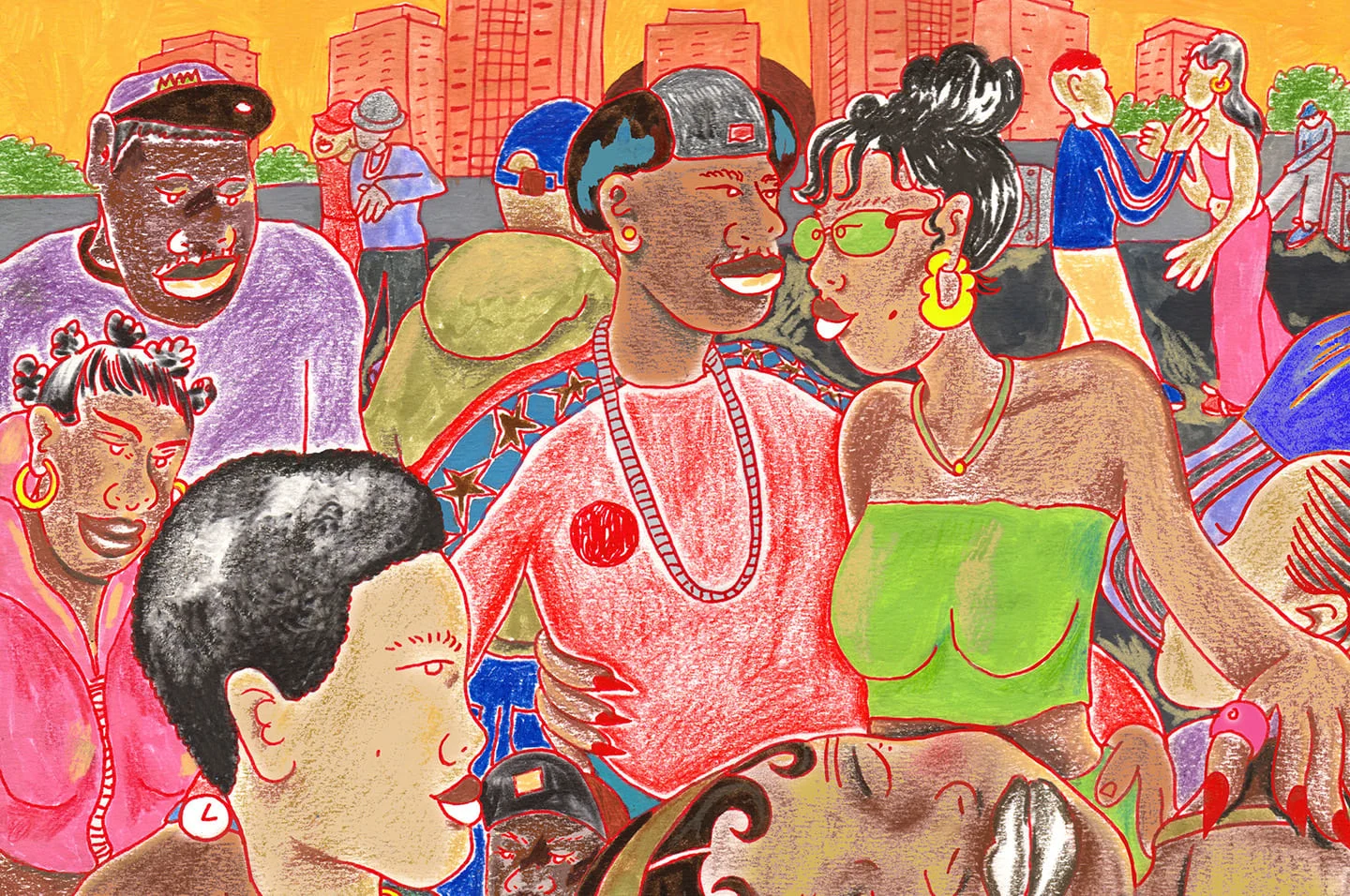
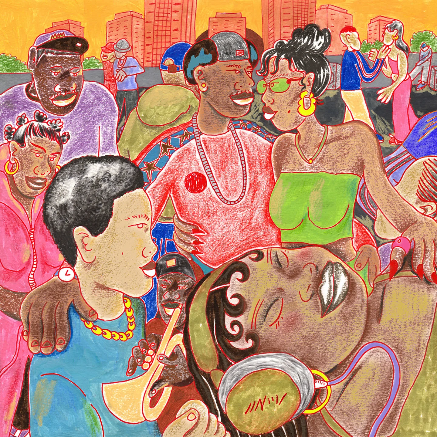
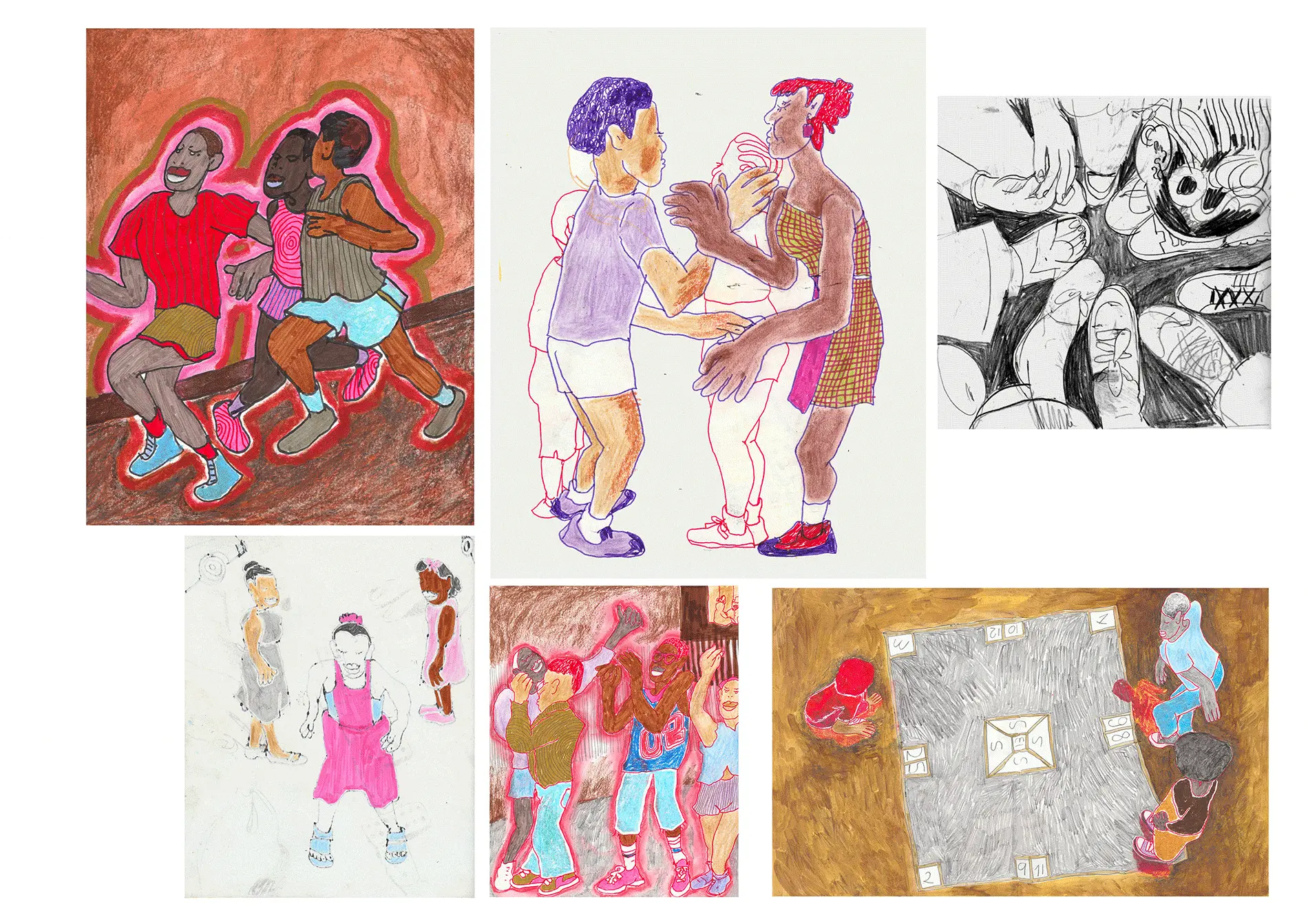
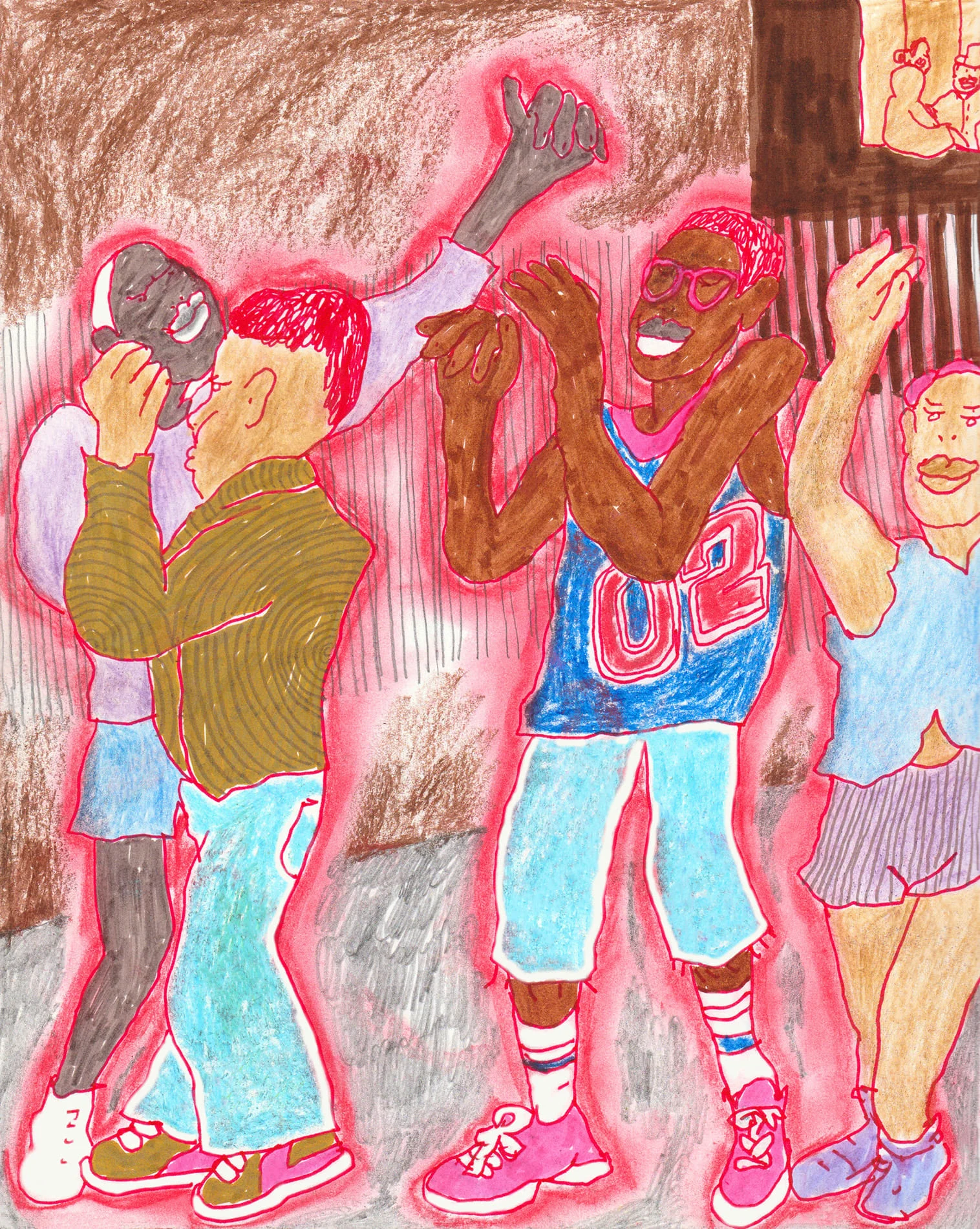
This was Pina’s first ever album cover—rendered in bright pencil crayons, red pen and gouache, the image is of a block party in the sizzle of summer where the lingering daylight, the presence of friends and family and the music makes everything seem a little more possible. It’s a picture of the joys to be found growing up in Black communities in the UK. “To us, if you grew up in an estate in the summer, it was the sweetest thing in the world. An African home with 10 cousins barbecuing and music blazing from every car and house,” co-bandleader and percussionist Onome Edgeworth says. Listening to the album for the first time, Pina experienced the music as sweet, warm and uplifting. “So those were the kind of feelings that I was trying to bring into the artwork,” she says.
The band provided ample visual inspiration: “A huge reference point for us was Spike Lee’s film ‘Crookyln’ which was based in Brooklyn, New York and a childhood favourite for Onome,” Maurice-Grey says. “Another big reference was the painting ‘The Sugar Shack’ by Ernie Barnes.” Pina also poured over old photographs from events like Notting Hill Carnival, and images documenting the Grime scene in early 2000s London. “It was nice to be looking at this period of time to see what was going on culturally for Black people in London,” she says.
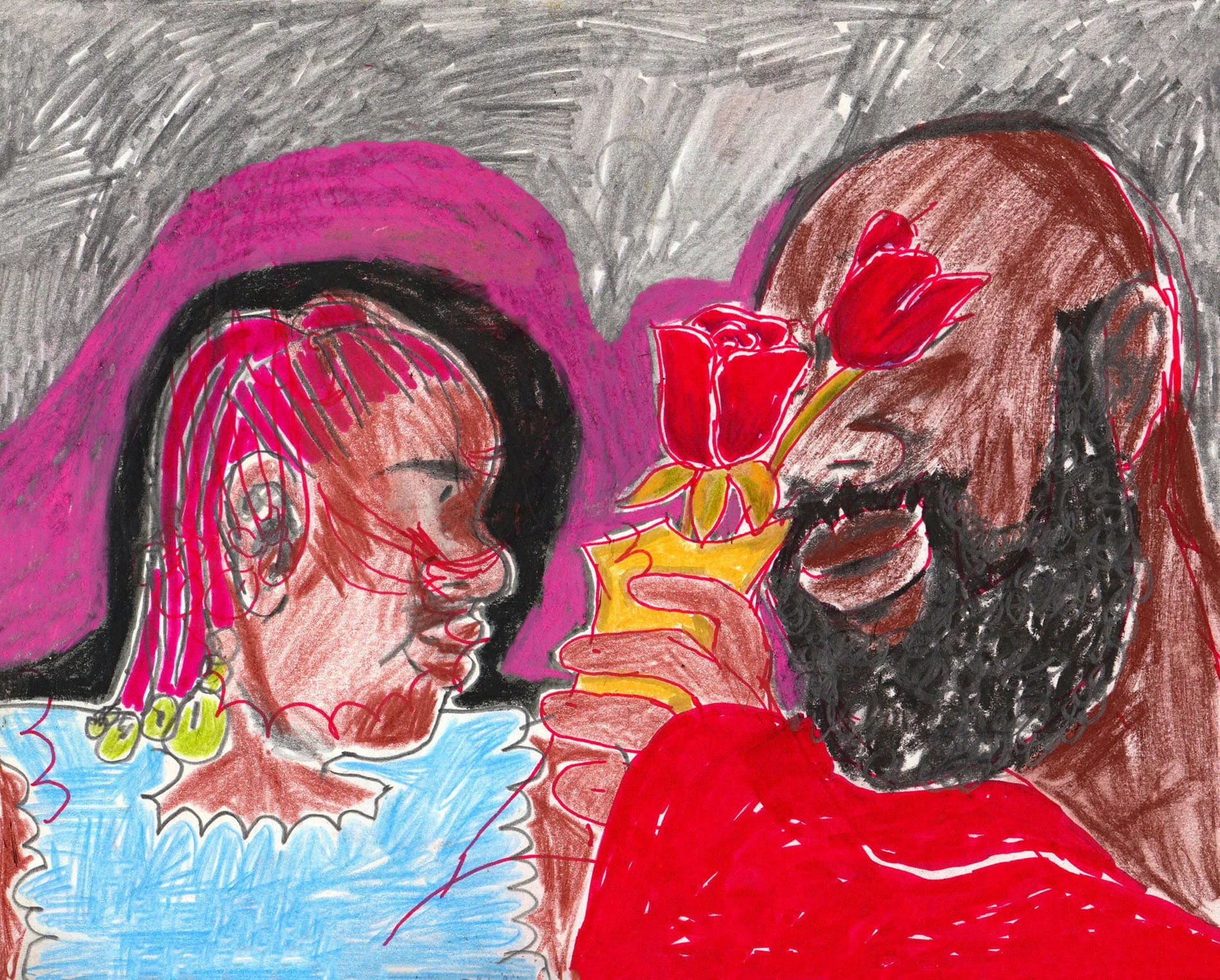
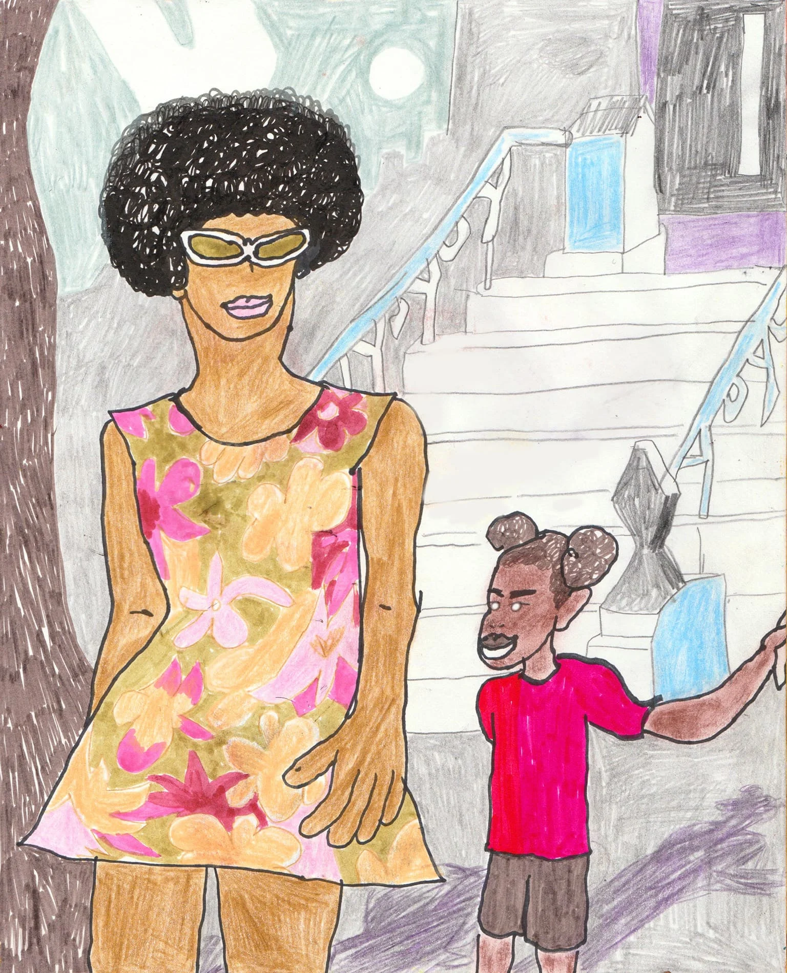
Based in Leeds today, Pina spent her teenage years in London (albeit a decade on from the noughties) so she also had some personal experience to draw from. “I think it’s a very Black thing to have people gathering around music outside in the summer, making noise and enjoying each other’s company,” she says. “There’s so much romance expressed in the music as well, but it’s alongside a community and family, and I can relate to that.” The central figures on the cover are a couple in love, eyes locked on each other, but arms out around the shoulders of people nearby showing their interconnectedness with their surroundings.
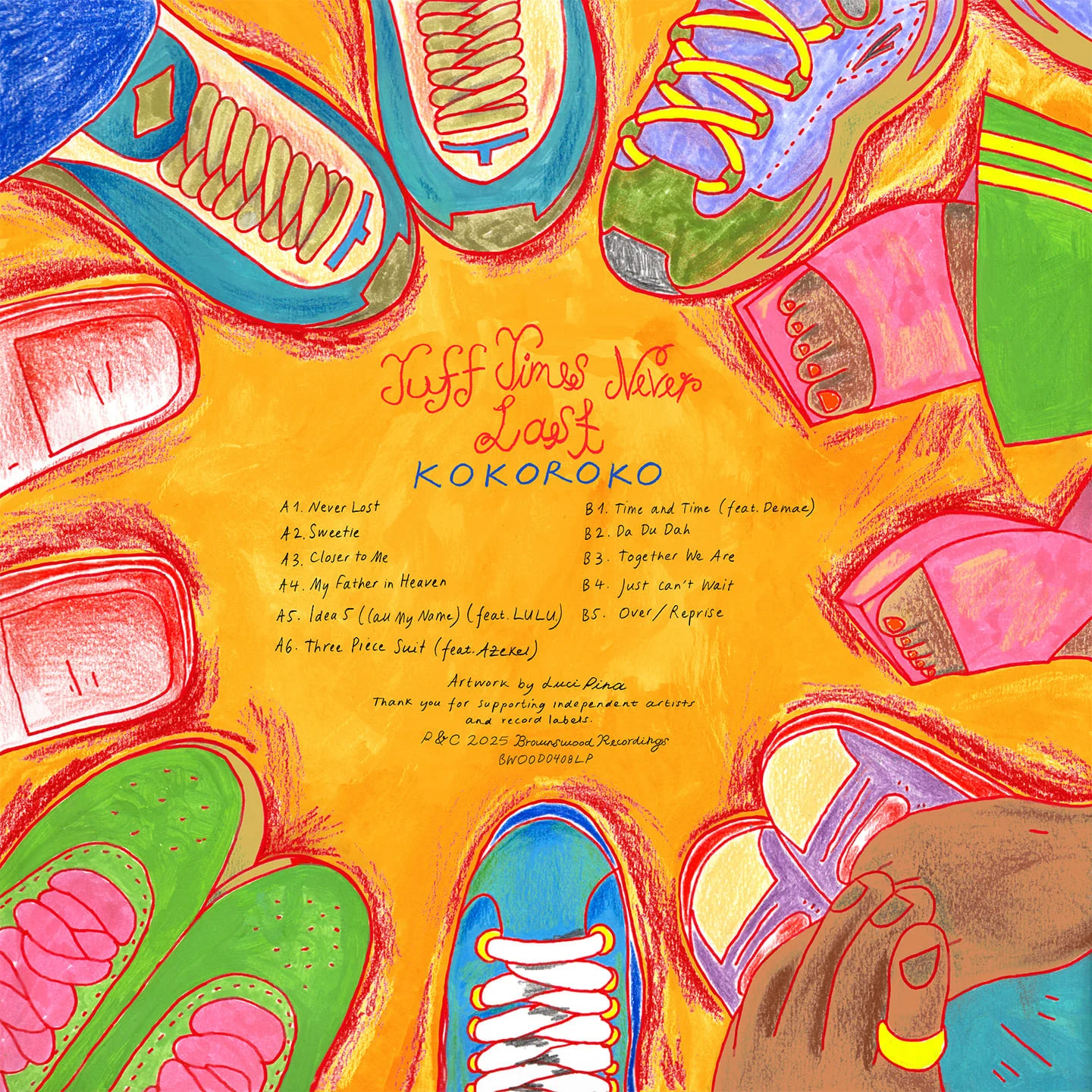
It’s fun to spot Pina’s hints at trends like green and yellow Adicolor tracksuit bottoms, or the shocking pink Motorola Razr flip phone in the artwork for single “Closer to Me,” but rather than rehash the past, her aim was to respond to the research by building a world that exists entirely for the music on the album. “It’s rooted in the real world, but I think my job was really to emulate the world that the music is talking about.”
To us, if you grew up in an estate in the summer, it was the sweetest thing in the world.
Pina was also less interested in having an idea of the final image from the onset than creating opportunities for discovery throughout the project. “I sat with the reference material for a significant amount of time and just drew,” she says. Watching “Crooklyn,” for example, she’d pause the movie at moments of interesting compositions and make loads of sketches from screenshots, opting to show these process drawings to the band over a more traditional approach of giving them three cover options to choose from. “The thought of having to come up with something final straight away feels quite restrictive to me,” Pina says. “I think the reason that the album art feels so organic and rich to me is because I wasn’t thinking about what it was going to look like from the beginning.”
“Illustration, and Luci’s in particular, feels quite reflective of the album making process,” Kebede says. “[Other mediums] can be just as thoughtful and organic, but the alchemy of illustration, in a way, resembles the process of walking into the studio with nothing and coming out with something. You also get that slightly more personal element with illustration; you’re not just looking at a snapshot of the band, rather, it’s the music through someone else’s eyes.”
There’s so much romance expressed in the music as well, but it’s alongside a community and family, and I can relate to that.
Pina always prefers an analog feel to digital slick. The texture of the color pencils on paper is particularly nostalgic, straight out of a school book or diary. “I think the organic use of materials and loose way in which I make marks is what makes my work interesting,” she says. “There’s a child-like innocence and playful energy that Luci has captured beautifully,” Maurice-Grey says. “Every time I look at the illustrations there’s always something new I haven’t noticed before. It makes it feel new each time, same with the music.”
On the back cover, the tracklist is written in Pina’s own handwriting. “It would’ve felt a bit alien to have some kind of digital type treatment,” she says. In keeping with the hand drawn illustration style, the text serendipitously extends the romantic themes in the album: a throwback to mix CD’s made for a summer crush, the title of each song scribbled with giddy hope and hormones.