It’s hard to find a new way to talk about gun violence. But what if you slow the conversation right down, and focus on a single family rather than the statistics that drive most of the debates. For two years, literary magazine Five Dials and WeTransfer worked on Anything But Guns, an interactive reading experience that does just that. Sophie King explains how it came together...
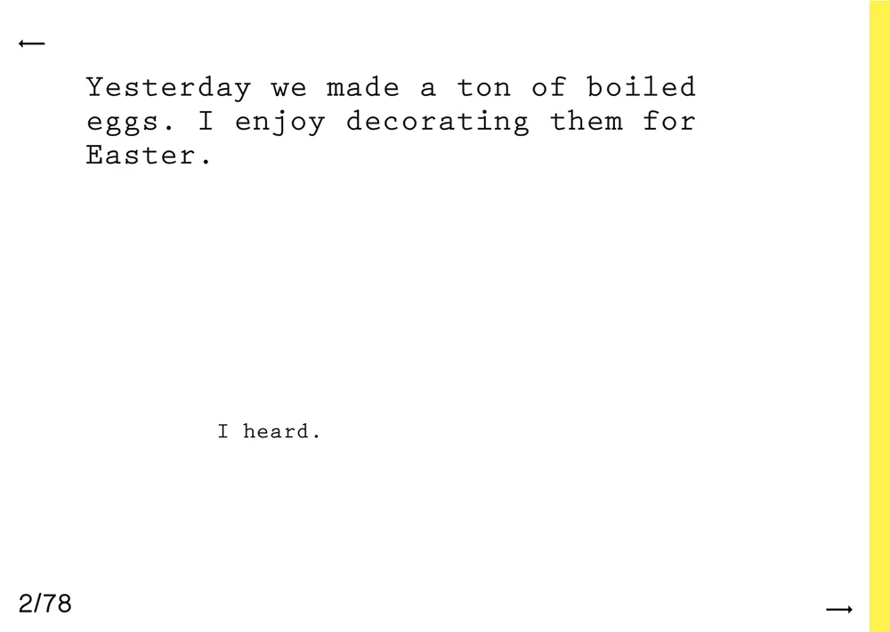
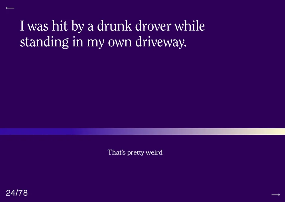
Anything but Guns is a story about how gun violence changed one family's life in an instant. It's an interactive conversation between we the readers and Carolyn, a mother whose daughter was killed in a mass shooting at a Utah mall in 2007.
It came out the day before the March for our Lives, when millions of people took to the streets calling for gun reform. But this complex canvas of emotion and education was many months in the making, from the initial idea to writing and editing, to artwork, design and development. Producing a project like this takes time, determination and teamwork.
Writer Craig Taylor was the man behind the project. In 2011, Craig published Londoners: The Days and Nights of London Now, a series of oral interviews with Londoners from all walks of life. The book – an unexpected hit – offered new way of thinking about a city and the hustle and bustle of London life. This hunger to tell familiar stories in innovative ways continued through Craig’s work as editor of the experimental online magazine Five Dials, and was one of the driving forces behind Anything But Guns.
“For me the appeal of this piece was the challenge – could we tell a gun violence story in a new way?” he explains. “The old ways were becoming depressingly repetitive.”
Craig knew Lee Keylock of storytelling platform Narrative 4. Lee had been teaching at a high school in Newtown, Connecticut when a shooter killed 20 children and six teachers at the nearby Sandy Hook elementary school in 2012.
The pair discussed digital storytelling in some depth, and Lee introduced Craig to Carolyn Tuft, whose daughter Kirsten was killed in a shooting at a mall in Salt Lake City in 2007.
“I got to spend hours and hours chatting with Carolyn,” Craig says. “I wanted readers to meet her, rather than just read about her as part of a news story. Years had passed, so the grief wasn’t raw, but Carolyn imbued her story with a meaning and a lot of love. She wanted me to get to know her daughter, so she recounted, with great care, the details of Kirsten’s short life.”
Craig approached WeTransfer as a publishing partner and he asked an old friend, Toronto-based artist and ink-maker Jason Logan to make visuals for the piece. Jason said yes almost immediately, but he too fell for the power of Carolyn’s story as he got deeper into it.
“It was not only emotionally-charged and politically critical, but also funny and down to earth and full of visceral, textural moments,” he says. “She transformed the unimaginable loss of a child into a set of images and feelings that felt raw and honest.”
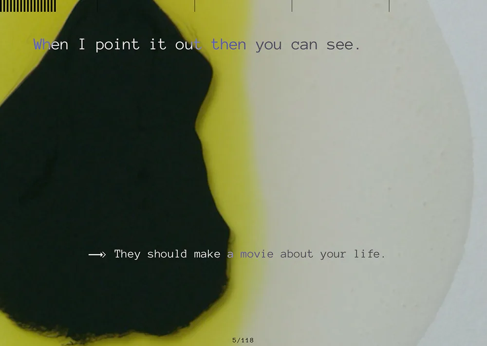
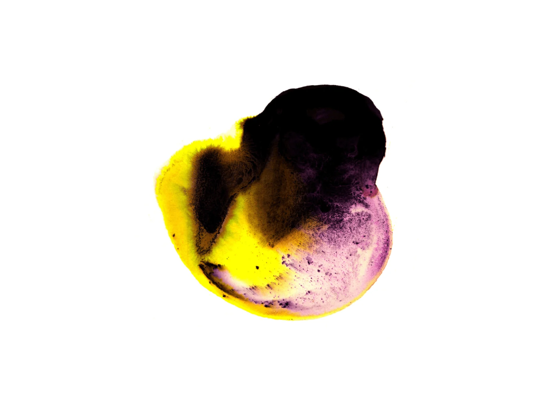
Together, Craig and Jason hit on the idea of using the chemicals that make up gunpowder as the artistic material to make the accompanying artworks. “I knew I wanted the story to employ a different kind of visual vocabulary,” Craig says. “Readers would begin to realize the colour washes dotted through the piece were made from the same elements of the substance used to propel bullets.”
But to create the art, you have to have the equipment. Jason found it unsettling to buy these deadly materials online. “It felt strange to be looking for stuff that you knew could be used in some terrible way, knowing in my heart that it was going to be used in some beautiful and interesting way that will just expand people’s minds.”
Jason spent hours and hours trialling and testing ways to create different effects with the gunpowder. By breaking it into its component parts, he was able to harvest colour and texture in unimagined ways. “One weekend I experimented with the potassium nitrate. The entire house was covered in jars, that to me amazement grew beautiful spiky crystals.”
But for Jason, and WeTransfer’s designer-developer leads Karen van de Kraats and Ulises Palao, it was vital that nothing overshadowed the story itself. “The loudest thing should be this personal story,” Jason explains.
When it came to presenting it properly, the biggest challenge was the length – the final edit comes in at around 4,000 words. “Usually you don’t ask people of that much time on the internet, you’re trying to feed them fast because they’re going to leave any minute,” Ulises says.
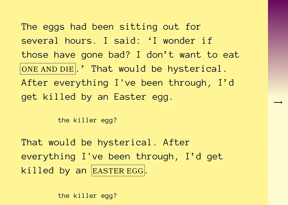
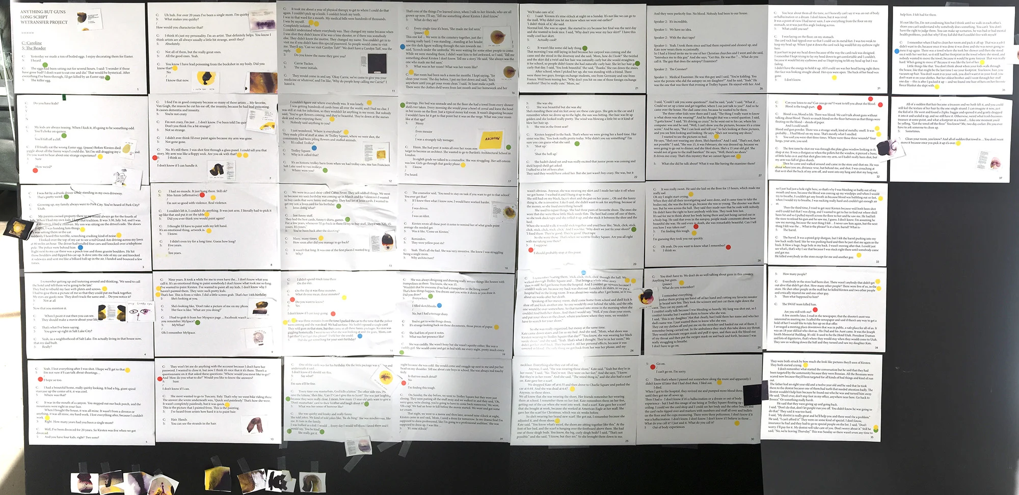
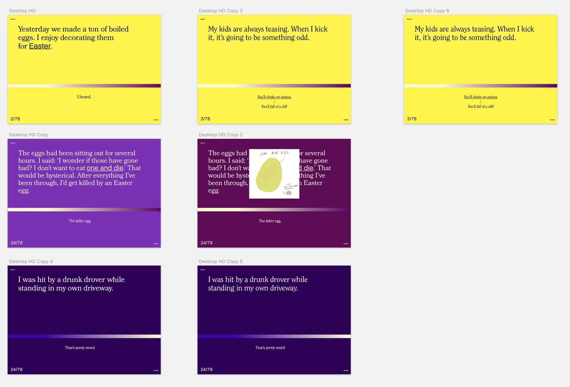
“We printed it out and hung it on the wall and then used stickers to mark the emotional points and the funny points,” Karen continues. That way, the team was able to see where they might be able to add audio or visual aids to add to the overall effect. Knowing when the art or design is competing too much with the text can be difficult, so plenty of interesting ideas didn’t make the final cut.
“It’s really easy to forget about the story and go too far in your own design ideas, which are not helping the reader,” Karen admits. The simpler, stripped-back look with its minimal color palette ended up being the most effective solution. The challenge then was to not become too staid. “It has to have a rhythm,” Ulises says. “When you read a book you always have the same movement.
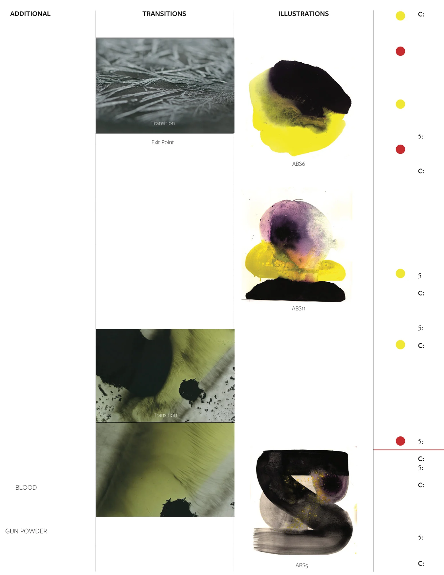
Another challenge was to incorporate exit points, a key part of Craig’s concept. Reading about gun violence is tough and so the team made sure to offer get-outs throughout. But by making the choice to leave, readers are also encouraged to think about why they can’t face such a story (and implicitly, why they can opt-out when Carolyn can never).
Karen says Craig’s input and feedback helped with various design decisions, and for his part, Craig was overwhelmed with the way this story took shape.
“It’s one thing to write a script, but the designers worked with artistry to ensure the story flowed,” he says. “I wanted readers to feel they were in the same room, across the same table, as Carolyn.
"I wanted to create the kind of intimacy missing from our discussions of gun violence. With this sort of storytelling the point is to draw the reader close. The story was powerful, but the execution of the design made it personal."
